Here are some pics of the final, finished luminaire:
Friday, December 10, 2010
the final design process. . . .
For the 2nd interim critique, I made sure I had the full scale structure in it's finished state. I used pieces of pine for the sides for two reasons: 1) I had them at my house 2) The pine that I had was actually leftover from the stairs that were recently installed, and the place the light would be in was directly across the hall from the stairs.
The sides were made from black mat board that I lined with an emerald green paper. One thing I hadn't considered when determining the size and shape of the luminaire was the difficulty in finding paper that was textured, like rice paper and handmade paper, in a large enough size to cover it completely.
I was still unsure about the top. Because I used a very smooth satin finished black mat board on the sides, I thought that the shape of the cutouts should compliment that. Instead of going with an organic, swirly shape I decided to use rectangles with varied widths. The top was made from the same mat board as the sides were.
I made the top to fit within the framed sides, so that it was flat on top.
I had several issues with the top piece:
1) The interior corners of the rectangle shapes were quite difficult to cut perfectly.
2) I didn't like the fact the the jointery at the top was visible (not to say that it was done poorly, it was the only place on the object that it was visable).
3) Because of the size of the rectangles, the inside of the luminaire was completely visable if you were to walk by it.
4) More light came out through the sides, diminishing the effect made by the top.
5) I felt the mat board on top made the piece look "unfinished".
In remaking the top to resolve these problems, I experiemented with different shapes.
In the one below, I drilled holes in Luon that followed the contour of a tree blowing in the wind.
I liked the way the luminaire looked with the light off more than the light effect it created. The effect was stacked circles of light, but it needed to be placed under a low, very flat ceiling in order to appear properly. I also felt that the shapes on the top didn't correspond to the rest of the luminaire.
Finally, I made the top out of wood, using the original rectangle cutout shapes. I then used thin mat board rectangles to divide the rectangles into equal parts. The whole piece was larger, enough to cover the entire top of the luminaire.
Tuesday, December 7, 2010
luminaire design process. . . .
After brainstorming and coming up with several different sketches, I realized that designing a luminaire would be much easier if it had a purpose and a place.
I had a couple preliminary ideas that somewhat resembled shallow shadow boxes, with rice paper acting as a diffuser for twinkle lights.
The twinkle lights didn't conform with the project assignment, however, and I felt as though tall skinny flimsy boxes might not travel to and from school very well.
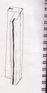
Then I saw a zen-looking black and white boxy lamp at the store, and carefully examined the way it was put together. I had my sketchbook, so I drew a quick sketch of how the joints were put together. A few days later I went to the wood shop with a few loose ideas and talked to Matt and AJ. Their knowledge helped me come up with a concrete plan and shape for the frame of my luminaire.

During the interim critique, it was pointed out to me that I really had 2 completely different effects at work. One was the intended, projected onto the wall and table top from the cutouts in the top and sides, and the other was the luminaire itself, brightly glowing green from the paper I used. Suggestions were made that I should experiment with different paper types, textures and layering while retaining the basic box form.
Right away I knew what problem I wanted to resolve with the design: I wanted to create a light source that could be left on all night without being obtrusive but was bright enough to light a long dark hallway. The space it would go in was about 4 feet wide with a 10 foot ceiling, and the light source would have to be very shallow so that it wouldn't be bumped into.
The twinkle lights didn't conform with the project assignment, however, and I felt as though tall skinny flimsy boxes might not travel to and from school very well.
Then I saw a zen-looking black and white boxy lamp at the store, and carefully examined the way it was put together. I had my sketchbook, so I drew a quick sketch of how the joints were put together. A few days later I went to the wood shop with a few loose ideas and talked to Matt and AJ. Their knowledge helped me come up with a concrete plan and shape for the frame of my luminaire.
 |
| It was crucial that the luminaire's dimensions fit the space, but I also wanted all the measurements to correspond with each other to create unity. |

 |
| The first model I made was much smaller than the final piece, to ensure my ideas were going to work without using too many materials. |
 |
| In making the model, I learned that precision with the nail gun is crucial. |
I had several ideas for how the top of the luminaire would look. I knew that this part would be the most important, as it would be responsible for most of the light effect. I made the top for the model out of paper, and tried several versions.
During the interim critique, it was pointed out to me that I really had 2 completely different effects at work. One was the intended, projected onto the wall and table top from the cutouts in the top and sides, and the other was the luminaire itself, brightly glowing green from the paper I used. Suggestions were made that I should experiment with different paper types, textures and layering while retaining the basic box form.
more light inspiration. . .
I have been "collecting" visual inspiration since I was a sophomore in high school. Back then, I made albums of magazine clippings organized by what attracted me to the page, such as color, graphics, or faces. The way I store my collection has changed since then; I store (and find) almost everything on the computer. Here are a few pictures that I've saved that have to do with lighting and light effect:
 |
| made from old cassette tapes |
 |
| cassette tapes, Cd's, and a few VHS tapes from dornob.com |
| love the wavy pattern - unique ambiance for a floor lamp |
 |
| several of these (like 5) lined up next to each other look amazing. . . like a miniature hedge (they stand about 18" tall). Using old pots and pans and a lacy design creates a great effect! From dornob.com |
Monday, December 6, 2010
drawing scale figures. . . .
We spent one of our drawing class periods learning about drawing scale figures. For practice we took turns modeling and drawing to a predetermined scale. We were timed, so each drawing was done in 5 minutes or less. We also practiced drawing with a few different drawing styles, including contour, detailed contour, gesture, and a combination.
lighting and light design: exploring precedent. . .
While researching some of the given designers and manufacturers, I found that they all had concepts and ideas that were new, groundbreaking, or just really cool. Keeping the final luminare project in mind, I chose a few of my favorite designs/designers to help get the ideas flowing.
Shigeru Ban
Shigeru Ban
" Project developed for the international cosmetic company Davines at the Cosmoprof fair in Bologna 2007. The concept was to materialize the idea of "sustainable beauty" using recycled materials as paper and to offer a space able to communicate the philosophy of the company. Visitors were invited to discover the products little by little due to all the transparencies crated by many different paper shapes" (http://www.shigerubanarchitects.com/)
I think that Ban's use of paper as a structural material in an effort to advance sustainability is groundbreaking.
He uses paper in an innovative way that pushes the limits of the materials' integrity while creating a design the urges people to explore it further. The structure of his objects become a part of the design.
In the pictures above, I love the way light bursts into the space, creating visual lines that pull the eye back to the paper wall. The angle and direction of the light lines are energizing and create excitement.
Peter Zumthor
Zumthor appears to take the opposite approach to his designs, at least with regard to sustainability. Critics of his architecture have called his buildings "jewels of luxury", specifically referring to the one below. It seems to be in the middle of nowhere, limiting its usefulness.
I like the way he uses a dichotomy of natural and man made objects and shapes. Rough textured rocks contrast with the perfect, smooth cylinder, and he uses repetition and light to emphasize the circles - a shape that is rarely seen in nature. The light source here appears to be natural, and I would be interested to know how he made the light effect appear so "crisp".
Joan Lao
The light effect in the picture below is really unique for a floor lamp. Generally, floor lamps don't focus as much on the effect as they do on the style of the lamp and shade. Here, both are celebrated. I love the way the photograph really portrays a sense of balance between light and dark shapes. Both the shade and stand are made from steel.This table lamp also creates a nice balanced effect. The base is steel and the shade is made of wooden slats. Both lamps were designed by Joan Lao in Spain, and
they can be found on the ylighting website.
Subscribe to:
Comments (Atom)


