Showing posts with label Environmental Design. Show all posts

Wednesday, May 4, 2011

Chitchen Itza, Mexico. . .

This is the pyramid where the Mayans held religious ceremonies.  The corners of the pyramid are exactly at North, East, South, and West, and when the summer solstice comes the effect between the sunlight and shadow creates a giant serpent coming down the pyramid.  There 91 steps on each side, and one step up to the temple on top, making for a total of 365 stairs, the same number as are days in the year.


Temple at the top of the pyramid.  Notice the shape of a face above the door.

Glyphs on the walls represent serpents, a symbol of life.  The part that looks like an elephant trunk is actually the nose of the Mayan sun god.

Mayans were very good at making cantilevered archways.  This type of archway was used in their palace and as entrances to sacred areas.  Also known as a corbel arch, these arches were constructed using a series of overlapping blocks, each going a little bit farther inward until the archway could be blocked using a single capstone.  The voids between the overlapping rocks were then filled with smaller stones.

Although some human sacrifices did occur, they were not unwilling victims thrown from the top of the pyramid as Hollywood suggests.  Those that were sacrificed were volunteers, and the ritual took place on top of a platform about 6 feet off the ground.  Since the sacrifices were a communal event and onlookers would not be able to see the top of the pyramid, it makes much more sense for the ritual to take place in a location that allowed for everyone to see.

This is a closeup of the Mayan version of a wailing wall, where those who died in battle were commemorated by a low relief glyph of a skull.  The heads of enemies were placed on stakes above the wall.

The ball court.  One of the reasons the court has maintained structural integrity over the years is because of the verticality of the wall.  Trees and other roots tend to not grow and destroy walls that go straight up.

Relief glyphs depict the story of the games played at the ball court.  The ball game was a battle to the death, but it was the winner that actually was the one that was killed.  The Mayans believed this to be a sort of fast-track to the gods.

Observational temple at the top of the ball court.

If the Mayan ball game was like basketball, this would be the basket.  The ball would be more than 3 pounds, and made of solid rubber - and not the bouncy kind, the really hard kind.

Serpents represented life forces, and on the stairway on the opposite side of the building would be the end of the snake.  Mayans believed in "theological architecture", which meant that in constructed stairs, you never wanted to turn your back to or face directly the gods worshipped in the pyramid.  The stairs were made of a very steep rise and shallow run, so that you had to kind of scoot up the stairs sideways.

When reconstructing one of the buildings, they have a few left over pieces.....so they made this statue as a tribute to the Mayan sun god.  In actuality, the left over pieces were from previous periods.  The Maya were known for building bigger and better pyramids on top of existing pyramids.

The Mayan Observatory.

This building is believed to be a palace, but is still undergoing reconstruction.

The giant wood beams that supported the ceiling have rotted long ago, causing the ceiling to collapse.  It's really interesting the see the remnants of such an architecturally advanced society!

Writer's retreat. . .

My writer's retreat plan includes a public and private entrance, a space for public readings, a public space to hold conferences and meetings, a public bathroom, a private office, a private space for reflection or entertaining, private kitchen and breakfast nook, and a private bedroom and bath.  Looking at the floor plan below, the private entrance is at the bottom left.  Upon entering the church, the bedroom and walk in closet is immediately to the right, while the open space for reflection and/or entertaining is on the immediate left.  Walking forward, one enters the kitchen.  The room on the left of the kitchen entrance is the private bath with a garden tub.  The refrigerator is on the right, with floor and wall cabinets on either side.  The rest of the kitchen is galley style, with dishwasher, sink, stove, and wall and floor cabinets on the far wall.  To the left of the kitchen set up is the breakfast nook, which includes built in bench seating (and cushions) and a pedestal based table.  Turing right and walking past the refrigertor, you would see the entrance to the laundry room on the left and the entrance to the private office on the right.  If you were to continue down that hall and through a door, you would then enter the public space.


 Below are the section elevations of the writer's retreat.  Section A (top left) shows the private reflection/entertaining space.  The top right picture is the key for the elevations, while the bottom elevation shows the public reading and conference space (far right), the private office, bedroom, and part of the private reflection space.


The perspective below shows the public space as seen from the front of the building and looking back toward the private space.  I choose to emphasize the shape of the roof by covering it with wood panels.  When thinking of the word retreat, I thought of a cabin in the woods.  Since the St. Mary's Church is right off campus in a city and nowhere near the woods, I wanted to bring the idea of nature inside.  I used slate columns to support a wood panel slanted ceiling.  The ceiling gives the impression of defined space for conferences and meetings, while mimicking the slant and materiality of the actual roof.  The cabinets between the columns add to the sense of defined space, but can easily be moved to create a type of podium for a speaker to give lectures or a writer to do public readings. 
For the private space, I wanted to maintain a sense of openness to the roof while simultaneously allowing the visiting scholar to feel like he or she were in a private residence.  Using the same slated panel idea, the office, public bathroom, hall, and bedroom would have a flat wood ceiling a height right above the existing windows - about 9 feet above the floor. 
The private reflection/entertaining space, kitchen and breakfast nook would all be open to the existing ceiling and defined by half walls.  The private bathroom's ceiling would mimic the conference space ceiling, with wood panels that peeked at 9 feet above the window and slanted down to 7 feet at the entrance to the bath.


 In the perspective below, the view is standing to the right of the fireplace and looking directly across the the public conference and reading space.


 Finally, my last and favorite perspective is that of the kitchen and breakfast nook.  I used different types of wood for the cabinets with a birch butcher block counter top.  The wall cabinets are ebony stained with frosted glass doors.  The molding, window and door trim, and floor throughout the house are a natural walnut color, a shade in between the dark paneled ceiling of the church and the lighter wood paneled faux ceilings.

Monday, April 4, 2011

Dining Space: parti, sketch model, and final model

With the dining space project, there were so many directions to go with it.  We had a few parameters, but the main ones - location and interior space - were not defined.  From the begining, I choose a path slightly different from other students.  I wanted to make my dining space more intuitive and free flowing, using elements of nature and instruments of dining from all over the world.  For my parti, I used shapes and materials that were cut organically and focused around a color scheme found in earth elements.
The dining space I envisioned was one that was mobile, and created the feeling of a close, intimate interior space while being outdoors.  I wanted to use bamboo, wood, and stone. 
I invisioned large elephant plant leaves as plates and chopsticks as serving utensils.  I wanted to have different chairs from all over the world to celebrate diversity and give the space a certain eclectic feel.

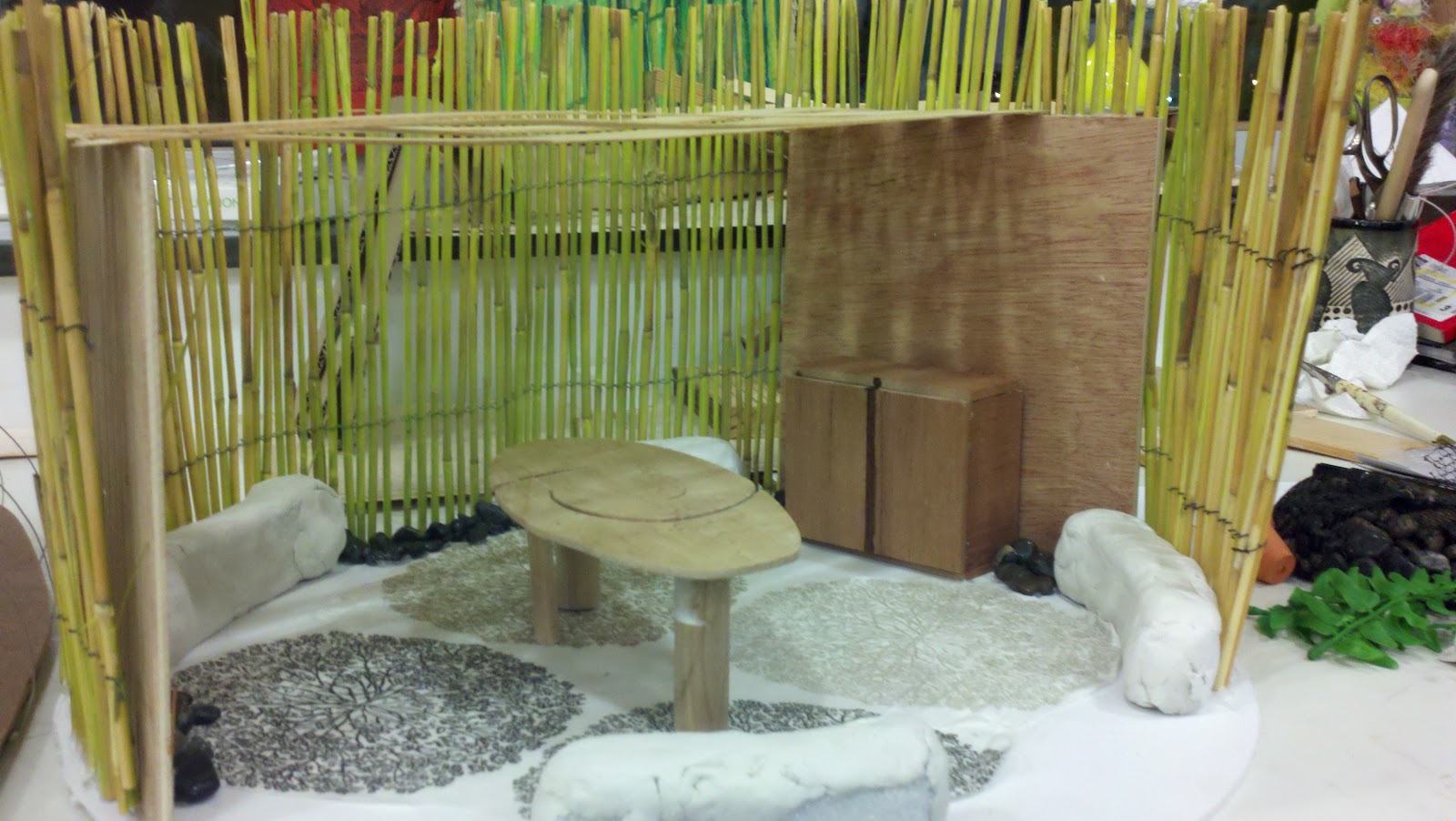
 For my sketch model, I used cardboard to make the table, sections of curved bench seating, bamboo walls, and "wooden" wall panels that would support a trelis type of ceiling overhang.  I envisioned the curved bench seathing to be backed by the living bamboo wall, creating the boundaries of the space.  The actual shape of the space itself would be an 18' diameter circle that could easily be positioned to the edge of a house or cooking area.

 Since the amount of people could vary, I felt that a table that could be utilized as a table for 4 or 10 person party was important.  But I wanted something a little different....so I designed a table that in hindsight utilized the shape of an enlongated ying-yang that can be lifted apart to reveal only half a ying (or yang).  The stability of each individual piece was important, so I put a thick circular post at the widest part of each section and a thinner circular post at the narrow part.
 I did most of a my final model at home, with out seeing what the other students were doing.  During our presentation, I noticed that mine was radically different.  Since it was our choice to create drawings and a model that best represented the overall feeling of our dining space, I choose to focus most of my energies on the model.  I used birch wood for the table top, cherry wood for the leg posts, and cedar for the sideboard.  The wall panels, which created privacy and space definition, were inspired by my need to have supoort system for the trelis ceiling.  Why the trelis ceiling?  I wanted intimate lighting to be able to be hung above the table!  I also wanted the diners to be able to look up and see the stars between the slats above them.  I used a piece of reed fencing to create the look of my space being surrounded by bamboo.  Styrofoam and modeling clay were used to create the rock bench seating, which I thought might be necessary if people wanted to mingle before or after dinner without having to sit at the table.  The actual dining chairs, since they would vary by the location of the dinner party, would be unknown until the location was selected.


Sunday, February 20, 2011

cantilope chair, revisited. . .

This is my model for the cantilope chair.  The wooden piece represents a social media touch screen computer.  The top would contect to something like a suspended bumber car track, slowly rotating the person and allowing them to interact with other people in the chair.  The cat-person is a scale model figure, just the right size for the chair!


Saturday, February 19, 2011

dining space narrative. . .

The dining space I'm creating is intended to accommodate 4-10 people from around the world comfortably.  Although the identities and nationalities are unknown, I imagine that the guests would arrive in pairs (2 from each region or country).  The event is biannual, and a different hosting location is selected for each occasion.  I intend for the dining space to be outdoors, building (kitchen) adjacent.  Living walls would create an alcove, adding elements of privacy, intimacy, and sustainability.  The nature element would give the guests a sense of interconnectedness, despite their various backgrounds. 

The symbol of 2 hands clasped in a peaceful gesture inspires the shape of a modular dining table.

dining table gestures
The decor is eclectic, reclaimed, natural, rich in color and warm.  Table settings are not from a generic set but rather each piece is an individual;  seating, decor, and settings are from all over the world.  Overhead lanterns provide an intimate glow over the table while accent lights highlight the living walls and define the edges of the space.  Slatted wooden wall panels would block unwanted views and support a slatted wooden roof over the table and parts of the space.  The roof/awning would serve function and aesthetic purposes:  overhead lantern light would hang from it while also providing shelter and intimacy.

preliminary sketch

design manifesto. . .

In no particular order, these are some of the tools I use to get to an end result:

sketch.  
When a project statement is first presented, immediately sketch out the first zygotes of ideas that come to mind.  They may not appear relevant in the beginning stages, but towards the end of the process looking back on them can be very useful.

inspiration.
Create an inspiration journal, scrapbook, computer file, box, or all of the above.  Add to it constantly.  Pieces of magazine, concept art, stuff that grabs your eye for whatever reason.  File each thing in a way that makes sense to  you.

organize.
Artists' and designers' work and living spaces are inherently a huge mess.  Boxes, folders, jars, binders and envelopes can help keep the piles of junk from seeping into one another.  LABEL EVERYTHING.  add the date of the last time it was organized.

take close-ups.
You never know when inspiration will find you.  Have a camera as much as possible. 

go for a walk.
Before starting a project, take a walk, preferably to a place you don't go to often.  The change of scenery will dilate your senses and help with fresh ideas.

do a lap.
If you've been intensely working on a project for hours, stop and walk around for a bit (or roll your office chair around the house/studio with ski poles!)

get help.
A fresh pair of eyes on a problem project can be life saving.

keep your workspace clean.
If you have to have food or a drink nearby, use the rule of planes:  always keep your work on a higher plane than anything that can spill or get knocked over.

And finally, the thing I need to do more often:

Work like the deadline is tomorrow morning,
until the deadline actually is tomorrow morning.

cantelope chair: bring old and new forms of media together

In today's world, staying connected with social media applications is a top priority.  More and more time is devoted to sitting in front of a computer screen, and even when we're on the go, our smartphones keep us updated constantly.  Casual arguement with a friend at dinner over last nights basketball game?  Pull up the replays on your phone and settle it then and there!  Trivia question?  Google it! 
But in this on-the-go environment, what has been lost?  Taking time out to sit and read a newspaper or book is all but gone.

 In an effort to combine the old social media with the new, I thought of creating a chair that enabled both.  These chairs would be located in a public spot, like an airport or lobby, and slowly rotate and glide around on a track suspended from the ceiling.  Shelves in the side of the chair could hold magazines, books, and newspapers.  A large touch screen moniter at one side would keep you sublty updated with your favorite social networks, while the rotation and movement of the chair would allow for face-to-face human interaction with others.

defining space with light. . .

For our first studio project of the semester, our goal was to define space within a 12x18 box using only light.  In order to create 4 specific areas within the box, I experimented with cutouts and the angle of the light source.  I kept thinking of Tadao Ando's use of light in the churches he designed. . .

from nocriticsallowed.blogspot.com
I made the cutouts in the box off center, and after some experimentation, elongated the rectangles to wrap around the sides of the box. 

The help define the space further, I used bristol board and bamboo skewers to bend the light and create shadow. 

The overall effect reminded me of an outdoor pavillion, so I created a scale figure to be the speaker.

(pics coming soon!!)


Wednesday, February 2, 2011

color week. . .

The following studies were created by cuting out shapes from silkscreened colored papers.  Each study is an example of how colors relate to each other.  The primary focus was to create the illusion of translucency and layers by finding the midtone between two or three colors.


Friday, December 10, 2010