The following is a chronology of my design process for this project. . .
stick hunting.
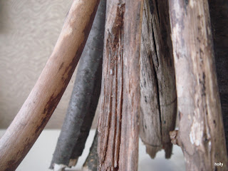
I wasn't exactly sure what I was looking for, so I gathered sticks of all shapes and sizes that appealed to me. I was especially drawn to the sticks that were "different", the ones that looked like they had a story to tell. Since I wasn't sure exactly what I was going to do with them, I cut or broke them to the longest length within the perameters of the assignment (18"). I kept the part of the stick that I found to be inspirational based on it's texture, variety, rythym, and movement - elements of design given to the stick by nature.
stick clustering.
My next step was to
unify my collection of sticks in some way.
 |
I choose only sticks that had a slight curve towards one end, then choose sticks that gave my final 12
a sense of balanced variety - thick and thin, old and new, dark and light, smooth and rough. |
design brainstorming.
Based on some of the words given on the project sheet, like pen, box, and corral, I felt that it was important the sticks where not an intregal part of the structure of their container. I wanted the sticks to convey a feeling of being able to come or go, much like sheep or cows are able to leave the area they are contained in if necessary. I used a thesaurus to come up with alternates for the word list given. Listed as a similar word for "corral", I found a word I'd never heard of,"dovecote". After doing some research on what it was (briefly, an elevated structure used to house pigeons) fragmented ideas started flooding in, so I went with it.
 |
My parti, which includes:
a brainstorming list, paper types, binding agent (wire), a stick (to visualize compatibility),
and some cylindrical shapes that I found to be inspirational and fitting to my concept. |
 |
In binding the sticks together, the emphasis was the curvature of the sticks. I carefully arranged them, again using the concept of balanced variety. |
trial. And error. design evolution.
These first attempts were an almost literal translation of the dovecote towers from medeval times. Representing the doves are the top ends of the sticks.
 |
| While I liked the idea of the of the sticks poking through the "windows", I ran into technical issues trying to make the paper cylindrical while the stick ends where acting as an opposing force. |
 |
| After creating the top piece, I was disappointed to find that I had just made a "rocketship". |
 |
| Canvas paper did not hold the form as I had hoped. |
Design challenges I faced consistantly were: how to make the paper cylinder appear as if it were floating around the sticks, how to keep the cylinder round, what size holes were needed for the sticks poking through and where exactly to put them, and how to make a flat piece of paper into a cylinder as seamlessly as possible.
 |
| In response, I fashioned a wire armature and used strips of canvas paper. The result was something resembling a rustic lamp, which wasn't quite what I had in mind. |
Extraction and Completion.
Talking with some of my design friends turned me in a new direction. Celebrating the individuality of the sticks, I hung them in a gestural way that allows each stick to be appriciated both individually and as part of the overall group.


