 |
| photos from: osc.hul.harvard.edu picasaweb.google.com http://homeschooling.about.com/library/tenochtitlancolor.pdf adventures.worldnomads.com crystalinks.com |
Monday, February 28, 2011
burda, reading response 7, iar 221
burda, blog post 7, iar 221
happy spaces, happy places. . .
What is it that makes one happy? An object, an area? A person? Thinking back to childhood, one of my happiest moments was more of a feeling of space than anything else. In the hot Ohio summers, I remember running around barefoot in the backyard, full of dandelions. During the nights I would still be running, still without shoes, with a large mason jar under my arm to catch fireflies. I would set the jar beside my bed and let them go in the morning....
While trying to find a happy space on campus, there was a little difficulty because of the bleak grey day it was.
Our group finally decided on the courtyard behind the art museum. For me, a happy space is outside, surrounded by greenery. I love the color green and plants give me peace. (It's too bad I can't keep a plant alive at my house!!)


I also found this area to be very happy and peaceful because it has elements of interactive fun that reminded me so much of making dandelion crowns and firefly nightlights as a child.

(of course, as an adult, the idea of of what's humorous has changed a little!)
Wednesday, February 23, 2011
how light effects space . . .
This is a little extreme, but still pretty cool. I wonder what happens to people once they interact with the space.
Living Room from Mr.Beam on Vimeo.
Living Room from Mr.Beam on Vimeo.
Monday, February 21, 2011
burda, blog post 6, iarc 221
In comparing the inside/outside of the gothic churches of Salisbury and Cologne, our group found that despite their apparent similarities that are really built quite differently.
Although large, the narrowness of Cologne's cathedral is quite noticable.
Notice also the amount of arches in Cologne. When compared with salisbury, it's easy to see that there are significantly more arches despite the fact that the square footage is smaller. Again, this tells us that the designers had to use that many arches to support the height because of they lacked a method to achieve the height otherwise.
Height:
Both churches have towers that remind the viewer of the heavens while pointing to the sky. The church in Cologne is quite a bit taller (although narrower). Our group discussed that one reason for this was because of it's location at the center of town, it needed to make a statement. The height of the church, however, came at a cost. The building is very narrow because the architects at the time didn't have the technology or understanding as to how to make the building wider at the height they desired without it collapsing upon itself.
 |
| http://www.agent2magazine.com/wp-content/uploads/2010/02/Cologne_Cathedral.jpeg |
Built later than the cathedral at Cologne, the cathedral at salisbury was able to achieve significant height, width, and depth.
 |
| portfolio.du.edu |
The effect from the inside gives the impression that it really is massive and impressesive, truly built on a grand enough scale to be a house of God.
 |
| ronsaari.com |
 |
| apriha.com |
Location:
When comparing the location of the two churches, one can speculate about the reasons for some of their architectural and design elements. Cologne's cathedral is located in the center of two, on the center axis of two main roads. I believe the reason that there are two towers is because visually and physically, one could draw a line right down the center of the main road and end up through the entrance and inside the church.
 |
| postmuse.blogspot.com |
Salisbury, though located in a bustling urban center, is surrounded by a grassy knoll. A small side street is barely detectable. It only has 1 tower, which marks the center of it's location. It says "hey, come check me out" instead of "you must walk through me to get to the other side.
 |
| geograph.org.uk |
In order to remember the churches and their differences, I used an adapted version of symbols we learned in class.
Cologne: ^ + ^
This reminds me that there are 2 tall towers and the church falls at the center of an axis.
Salisbury: ^
O
The circle with an arrow head tells me that the church is at the center of an open area and only has 1 tower.
Sunday, February 20, 2011
burda, reading response 6, iar 221

cantilope chair, revisited. . .
This is my model for the cantilope chair. The wooden piece represents a social media touch screen computer. The top would contect to something like a suspended bumber car track, slowly rotating the person and allowing them to interact with other people in the chair. The cat-person is a scale model figure, just the right size for the chair!


Saturday, February 19, 2011
dining space narrative. . .
The dining space I'm creating is intended to accommodate 4-10 people from around the world comfortably. Although the identities and nationalities are unknown, I imagine that the guests would arrive in pairs (2 from each region or country). The event is biannual, and a different hosting location is selected for each occasion. I intend for the dining space to be outdoors, building (kitchen) adjacent. Living walls would create an alcove, adding elements of privacy, intimacy, and sustainability. The nature element would give the guests a sense of interconnectedness, despite their various backgrounds.
The symbol of 2 hands clasped in a peaceful gesture inspires the shape of a modular dining table.
The decor is eclectic, reclaimed, natural, rich in color and warm. Table settings are not from a generic set but rather each piece is an individual; seating, decor, and settings are from all over the world. Overhead lanterns provide an intimate glow over the table while accent lights highlight the living walls and define the edges of the space. Slatted wooden wall panels would block unwanted views and support a slatted wooden roof over the table and parts of the space. The roof/awning would serve function and aesthetic purposes: overhead lantern light would hang from it while also providing shelter and intimacy.
The symbol of 2 hands clasped in a peaceful gesture inspires the shape of a modular dining table.
 |
| dining table gestures |
 |
| preliminary sketch |
design manifesto. . .
In no particular order, these are some of the tools I use to get to an end result:
sketch.
When a project statement is first presented, immediately sketch out the first zygotes of ideas that come to mind. They may not appear relevant in the beginning stages, but towards the end of the process looking back on them can be very useful.
inspiration.
Create an inspiration journal, scrapbook, computer file, box, or all of the above. Add to it constantly. Pieces of magazine, concept art, stuff that grabs your eye for whatever reason. File each thing in a way that makes sense to you.
organize.
Artists' and designers' work and living spaces are inherently a huge mess. Boxes, folders, jars, binders and envelopes can help keep the piles of junk from seeping into one another. LABEL EVERYTHING. add the date of the last time it was organized.
take close-ups.
You never know when inspiration will find you. Have a camera as much as possible.
go for a walk.
Before starting a project, take a walk, preferably to a place you don't go to often. The change of scenery will dilate your senses and help with fresh ideas.
do a lap.
If you've been intensely working on a project for hours, stop and walk around for a bit (or roll your office chair around the house/studio with ski poles!)
get help.
A fresh pair of eyes on a problem project can be life saving.
keep your workspace clean.
If you have to have food or a drink nearby, use the rule of planes: always keep your work on a higher plane than anything that can spill or get knocked over.
And finally, the thing I need to do more often:
Work like the deadline is tomorrow morning,
until the deadline actually is tomorrow morning.
cantelope chair: bring old and new forms of media together
In today's world, staying connected with social media applications is a top priority. More and more time is devoted to sitting in front of a computer screen, and even when we're on the go, our smartphones keep us updated constantly. Casual arguement with a friend at dinner over last nights basketball game? Pull up the replays on your phone and settle it then and there! Trivia question? Google it!
But in this on-the-go environment, what has been lost? Taking time out to sit and read a newspaper or book is all but gone.
In an effort to combine the old social media with the new, I thought of creating a chair that enabled both. These chairs would be located in a public spot, like an airport or lobby, and slowly rotate and glide around on a track suspended from the ceiling. Shelves in the side of the chair could hold magazines, books, and newspapers. A large touch screen moniter at one side would keep you sublty updated with your favorite social networks, while the rotation and movement of the chair would allow for face-to-face human interaction with others.

defining space with light. . .
For our first studio project of the semester, our goal was to define space within a 12x18 box using only light. In order to create 4 specific areas within the box, I experimented with cutouts and the angle of the light source. I kept thinking of Tadao Ando's use of light in the churches he designed. . .
 |
| from nocriticsallowed.blogspot.com |
The help define the space further, I used bristol board and bamboo skewers to bend the light and create shadow.
The overall effect reminded me of an outdoor pavillion, so I created a scale figure to be the speaker.
(pics coming soon!!)
Wednesday, February 16, 2011
burda, unit summary 1, IAR 221
New Layout (after considering suggestions in the comments):


Original Layout:


Tuesday, February 15, 2011
more things to do with old cans. . .
In light of our coke can cathedral experience in theory tomorrow, I thought I'd post a few pics of some alternate things that can be done with cans. The ones below came from an email from my mom.


Monday, February 14, 2011
texture value study: fabric, bamboo, carpet, slate
 |
| There are two studies of each material, 1:1 (left) and 12:1 (right). I choose to draw the 1:1 ratio in graphic pen, and the 12:1 in graphite. From left to right, the materials are: fabric, bamboo, carpet, slate. |
Here are the samples I've chosen draw for our value and scale studies of textured coverings - I only wish we could add color!
 |
| vintage upholstry fabric |
 |
| bamboo flooring |
 |
A hand woven silk rug |
 |
| slate tile |


Sunday, February 13, 2011
burda, blog post 4, iar 221
In response to the prompt, I would have to agree with most that the new music building ranks highest on the commodity, firmness, and delight scales. Clearly, it is built to withstand the test of time, and pleasurable to view from both the outside and inside. It has resonating elements - circles, for example - that are used as both architectural elements and design elements on the exterior and interior. Classrooms line the corridors, and soundproofing is hung effeciently throughout, especially in the low-ceiling halls.
The main entrance of the building is placed neatly at the end of a long axis - college ave, and while situated in a secluded area of campus, the journey to the building gives the viewer a sense of wonder, preciousness, and even sacredness.
However, in viewing the university as a whole and taking the above mentioned scales into account, I believe that the overall organization of the buildings, roads, and recreational areas is haphazzard at best. The university as a whole appears exactly has it was made: as the size of the student population increased and more spaces were made to accomodate them, buildings seemed to be plunked down with no real foresight or hindsight. I feel as though the architects failed to take into account the fact that there were actually going to be people attending the school, not just life-size scale models.
"in other words, does the space or moment mark something of significance or value in our understanding of the campus and who we are as a university?"
In short, no. There is no center, no focal point, and it seems and that all roads, that is to say all axis, lead to nowhere in particular.

Friday, February 11, 2011

Wednesday, February 2, 2011
color week. . .
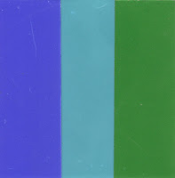
The following studies were created by cuting out shapes from silkscreened colored papers. Each study is an example of how colors relate to each other. The primary focus was to create the illusion of translucency and layers by finding the midtone between two or three colors.


Subscribe to:
Posts (Atom)