
Friday, April 29, 2011
Burda, BP 14, IAR 221
Object, Space, Building, Place: 4 things that I love!
Object: My snowboard


My snowboard is one of my favorite objects because it gives me the oppertunity to see parts of the world that I'd never get a chance to see if I didn't ride. The view from the top of the mountain on a crisp, clear morning after a night of heavy snow is one of the most beautiful sights in the world. Any noise is muffled by the snow and whether I'm sailing through fresh powder or riding the lift to the top, I'm filled with a sense of serenity that clears my mind and allows me to appriciate nature at it's fullest.

Building: Frank Gehry
When I was reflecting on really cool buildings I'd seen, two came into mind. One was in Cleveland, Ohio, and the other was the building fronted by a giant pair of binoculars in Venice, California. I had a feeling that the binocular building was by Frank Gehry, but I had no idea that the building I was thinking about in Cleveland, the Peter B Lewis building, was also by Gehry.
 |
| Peter B Lewis building in Cleveland, Ohio |
 |
| Chiat-Day building in Venice, California |
 |
| Claes Oldenburg's "Free Stamp" in Cleveland, Ohio |
Place: Savannah, Georgia
I love visiting Savannah because of the tremendous amount of history and architecture. The downtown city blocks are arranged beautifully, and the spanish moss dripping from the trees makes it seem like you are walking into another place and time. The georgian and Victorian homes are breathtaking. I also appriciate that SCAD, Savannah College of Art and Design, has taken it upon themselves to purchase and renovate old and decrepide historic buildings. In this way, Savannah is truely an architectural link between past and present.
 |
| Downtown Savannah, Georgia |
 |
| One of the beautiful historic homes in Savannah |

 |
| Yogi especially liked Savannah because the historic bus tour doesn't discriminate against Pitt Bulls! |
 |
| SCAD building in Savannah, Georgia |
Thursday, April 28, 2011
Perspective of downstairs hall . . .
For my perspective drawing, I choose a space in the downstairs hall. I choose the middle of the hall becausse I thought the contrast between the way the brick wall looked up close, in perspective, and as part of the picture plane was very interesting. I think the most difficult part of the drawing was how to represent a white brick wall from far away. I wanted to make sure the viewer could read the farthest brick wall as brick, but it was difficult for me to read it as brick from the location I was drawing it. It didn't help that on a bright sunny day, the windows were backlit and washed everything out. In order to compinsate for this problem, I went to the downstairs hall at different times of the day on night to be able to more clearly achieve my goal.

Tuesday, April 19, 2011
Monticello and Fallingwater comparative composition . . .
While looking through the pictures and sketches I had done while at Monticello and Fallingwater, I realized that landscape was just as important for both locations but in contrasting ways. At Fallingwater, Wright positioned the house in such a way as not to disturb the natural beauty of the surrounding forest. At Monticello, Jefferson carefully manicured the immediate surrounding landscape to suit his needs. But he didn't have control over every aspect of the nature around his home, as the giant twisted tree in the front yard shows us.
I choose to highlight the natural and manicured beauty of each landscape in my comparative composition.

Monday, April 18, 2011
kinda random

two views of design: a matter of confidence
After considering the role "pop" media and education has to play in the design field, I have a very strong mixed opinion.
Education, of course, is very important. As a slightly older student who has some experience in the field, I realize that where the importance of education lies is a tricky line. While going to school for fine art in Los Angeles, I spent my free time remodeling condos, pizza shops, and other small businesses with a group of friends and workers. Since I was an involved art student that could operate a saw, everyone I knew wanted me to come and remodel or help them design their dream home. While I appreciated the contacts and the compliments, I felt a little uncomfortable approaching someone in a business manner, looking over their place, and giving an estimate of the work to be done. I attribute this uneasiness to the fact that while I have a good artistic eye, I really had no idea what I was doing or the proper process to take. I think that process and developing your own style is one of the biggest components of working through school (be it art or design school). Pulling yourself out of the comfort zone with people around you that have a vested interest in nurturing your personal growth and maturity is really one of the biggest plus sides of the time and effort put into college.
The other component of education is the actual degree. In real life, and especially in the art and design field, employers want to see that you have the stamina to make it through those 4 and some odd years of college; they want to see that you have the stamina to see a job through to the end. If you happen to luck out and land a killer job without (or before) getting your degree, then by all means go for it. But in reality, most employers won't even look at your resume if they see you don't at least have a bachelor in something. And once again, this is especially true in the art/design field. I think anyone can be a fly-by-night artist and luck out by putting out some cool stuff that the right people in the right place at the right time will love. But employers realize that most of the people that do this are (odd) really not the type of personality suited for the working environment. They want to see the you can go the long haul.
As for the idea of "pop" media, I real think it is a necessary evil. Wouldn't it be nice if we were still in a time where professionals did professional work, if you didn't know how to do something you hired someone that did, and photos were still taken with film? The reality is, if you want to tile your bathroom, you search a couple youtube videos, head to home depot, and get 'er done yourself. Photography, while I appriciate the field and the professionals, has moved to a place where any amature with a good smart phone can get lucky every once in a while. Everyone and their brother is throwing stuff up on the internet, and someone somewhere is bound to find something they are willing to pay for if you get enough exposure. Will this internet/media frenzy/amature to professional fad last? Probabally. Will it work individually for the long haul? I doubt it. When we spoke today about the design on the dime guy, Brice, a lot of people in class thought that he didn't deserve to be where he was because he had a limited educational background. Well, obviously he's doing something right. He's making a lot more money than any of us are right now, and he's the host of a design based television show. If it were a matter of all luck, he would have never lasted in that position. Clearly people are liking what he's doing or he would have been booted long ago.
Bringing it full circle, I think that people with a strong artist or designer eye are going to be involved in art and design even if their educated in banking (or whatever else). If people like your work, well, that's a matter of taste and presentation. And luck. I believe that schooling is for providing rules and the thought process to break them. If you can do that already and have some pull in the design world, then by all means go for it!
burda, reading response 13, IAR 221
 |
| Sources (for pics): http://www.notcot.org/post/29572/ murderiseverywhere.blogspot.com thejumpingfrog.com cgi.ebay.com |
Monday, April 11, 2011

burda, blog post 12, IAR 221
The ARCO floor lamp. . . as good design for all!

Originally designed in 1962 by Achille Castiglioni, the Arco floor lamp remains one of the most recognizable pieces of modern design today. A true beacon of “form meeting function”, the Arco lamp continues to be a symbol of the chic and prestigious in the design world.
The simplicity of the design is what makes it a modern classic. It has a simple rectangular marble base, a straight rod attached to a telescoping curved rod, and a lamp shade. The curved form of the lamp shade is a reflection of the curved rod, providing balance and repetition as design elements. The form of the metal lampshade has enough observable volume so as to achieve harmony and balance with the solid marble base. A circular hole shape also ties the two pieces together. In the shade, the hole is in the form of circular perforations, allowing the heat to escape. In the base, a circular hole provides not only a place to attach the vertical rod, but also allows the user to insert something (like a broomstick) to make moving an easier task. Instead of sharp right angles, the corners of the marble base are rounded, deliberately mimicking the curved form as a design element. The materials used are also in perfect harmony; they blend natural with man-made, marble with metal, so when added to almost any décor, the lamp becomes an unobtrusive element to the overall design of a room or interior.
The multi-use functionality of the Arco lamp has also made it a staple in the design world. Providing direct light onto a table without the need of a ceiling fixture allows for more flexibility in the arrangement of a room. Since it has a telescoping rod, the lamp’s height can be adjusted to fit the need of user at any particular time. Lowered, it becomes a useful task light. When raised, it can be used for anything from a spot light or a reading lamp to a source of ambiance in a room. While sustainability was not an original concept for the lamp, it proves to be environmentally friendly because its materials are archival in nature, its purpose is multifunctional, and its design will never go out of style.
Through clever and deliberate design, the Arco floor lamp provides a solution to a common lighting problem while unobtrusively adding style as an element to the design of any room or interior.
And although most people cannot afford an original arco floor lamp, there are enough reproductions of this classic design style in every price range so that nearly anyone could afford it.
 |
| Source: http://www.metromodern.biz/lighting.html?start=12 |
Friday, April 8, 2011

Wednesday, April 6, 2011
burda, reading response 11, IAR 221
 |
| Sources for pics: alicetye.blogspot.com brodata.co.cc flickr.com ideaelevator.co |
Burda, BP 11, IARC 221
Action. Reaction. Response. Cycle.
Everything that is done is based, either loosely or directly, on something that's been done before. The renaissance responded to the gothic and dark ages. It created rules. The baroque stretched and broke those rules, pushing the limits a little further. Neo-classism wanted to once again go back to basics, and the victorian pushed the ornamental. At the beginging of each of the design time frames, innovators were considered cutting edge and dramatic, evolving over time to acceptance and the norm. Today, modernism is becoming synnomous with sustainability, reacting to our careless ways we've treated the environment in previous years. Limited natural resources, along with space, force us to create and innovate new sustainable technologies. For example, solar panels, once critized for high initial costs and less than appealing looks, are appearing everywhere, from the tops of highrises to streetlights to lawn ornamentation.
Upcycling is another new trend in architecture. Taking the idea from shanty towns, some firms have gone to the extreme, creating chic houses and other buildings with found materials. Below, the dutch firm used such things as broken umbrellas and busted billboards to creating lighting solutions and handrails.

Everything that is done is based, either loosely or directly, on something that's been done before. The renaissance responded to the gothic and dark ages. It created rules. The baroque stretched and broke those rules, pushing the limits a little further. Neo-classism wanted to once again go back to basics, and the victorian pushed the ornamental. At the beginging of each of the design time frames, innovators were considered cutting edge and dramatic, evolving over time to acceptance and the norm. Today, modernism is becoming synnomous with sustainability, reacting to our careless ways we've treated the environment in previous years. Limited natural resources, along with space, force us to create and innovate new sustainable technologies. For example, solar panels, once critized for high initial costs and less than appealing looks, are appearing everywhere, from the tops of highrises to streetlights to lawn ornamentation.
 |
| Solar lights are becoming so descrete that they're barely noticable during the day. From solarlightssite.com |

 |
| The dutch firm 2012 Architecten utilized google earth and local contracts to bring a whole new look to the "upcycled home". From http://dornob.com/billboards-umbrellas-junk-dwelling-upcycles-local-scrap/ |
Monday, April 4, 2011
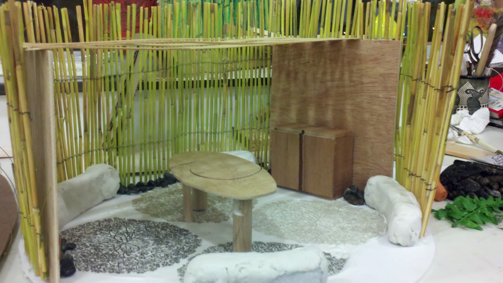
Dining Space: parti, sketch model, and final model
With the dining space project, there were so many directions to go with it. We had a few parameters, but the main ones - location and interior space - were not defined. From the begining, I choose a path slightly different from other students. I wanted to make my dining space more intuitive and free flowing, using elements of nature and instruments of dining from all over the world. For my parti, I used shapes and materials that were cut organically and focused around a color scheme found in earth elements.
The dining space I envisioned was one that was mobile, and created the feeling of a close, intimate interior space while being outdoors. I wanted to use bamboo, wood, and stone.
I invisioned large elephant plant leaves as plates and chopsticks as serving utensils. I wanted to have different chairs from all over the world to celebrate diversity and give the space a certain eclectic feel.


Subscribe to:
Posts (Atom)